Pythonを扱っている際に、matplotlibを使って目的にあった円グラフをわかりやすく作りたいので、
2つの円グラフを縦に並べて任意の色で表示するためのテンプレートを作成してみたました。
2つのDataFrame(df1とdf2)のデータを基に、2つの円グラフを縦に出力する内容です。
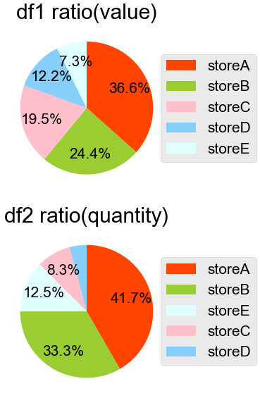
▲こちらが今回の記事で紹介するコードによって生成される円グラフです。
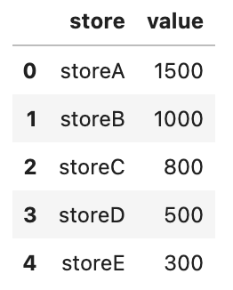
▲df1の中身です。
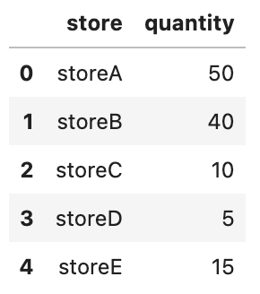
▲df2の中身です。
Pythonコードはこちらです。
import pandas as pd
import matplotlib.pyplot as plt

data1 = [['storeA', 1500],
     ['storeB', 1000],
     ['storeC', 800],
     ['storeD', 500],
     ['storeE', 300]]
df1 = pd.DataFrame(data1, columns = ['store', 'value'])
df1 = df1.sort_values('value', ascending=False)

data2 = [['storeA', 50],
     ['storeB', 40],
     ['storeC', 10],
     ['storeD', 5],
     ['storeE', 15]]
df2 = pd.DataFrame(data2, columns = ['store', 'quantity'])
df2 = df2.sort_values('quantity', ascending=False)

plt.rcParams['font.family'] = "Arial Unicode MS"
plt.style.use('ggplot')
plt.rcParams.update({'font.size':15})

color_dic = {'storeA':'orangered', 'storeB':'yellowgreen', 'storeC':'pink', 'storeD':'lightskyblue', 'storeE':'lightcyan'}

fig = plt.figure(figsize=(9, 6),dpi=100)
plt.rcParams['font.family'] = "Arial Unicode MS"

ax1 = fig.add_subplot(211)
label1=df1.iloc[0:len(df1), 0]
y1 = df1.iloc[0:len(df1), 1]
col1 = [color_dic[shop_column] for shop_column in df1.iloc[0:len(df1), 0]]
ax1.pie(y1, colors=col1, counterclock=False, startangle=90, autopct=lambda p:'{:.1f}%'.format(p) if p>=5 else '',
        pctdistance=0.7)
ax1.legend(label1,fancybox=True,loc='center left',bbox_to_anchor=(0.9,0.5))
ax1.set_title("df1 ratio(value)")

ax2 = fig.add_subplot(212)
label2=df2.iloc[0:len(df2), 0]
y2 = df2.iloc[0:len(df2), 1]
col2 = [color_dic[shop_column] for shop_column in df2.iloc[0:len(df2), 0]]
ax2.pie(y2, colors=col2, counterclock=False, startangle=90, autopct=lambda p:'{:.1f}%'.format(p) if p>=5 else '',
        pctdistance=0.7)
ax2.legend(label2,fancybox=True,loc='center left',bbox_to_anchor=(0.9,0.5))
ax2.set_title("df2 ratio(quantity)")

fig.tight_layout()
fig.align_labels([ax1, ax2])
plt.show()

fig.savefig('two_pie_charts.png',bbox_inches='tight',pad_inches=0.05)
・data1とdata2を書き換えれば、お好みのグラフを作れるかと思います。
df1 = df1.sort_values('value', ascending=False)
df2 = df2.sort_values('quantity', ascending=False)
▲円グラフは、割合が多い順に表示されるように、並べ替えをしています。
color_dic = {'storeA':'orangered', 'storeB':'yellowgreen', 'storeC':'pink', 'storeD':'lightskyblue', 'storeE':'lightcyan'}
▲df1とdf2の並べ替えたとしても、storeA~storeEが特定の色になるように、storeとcolorの対応関係を辞書型として color_dic に入れています。
指定する色の参考は、こちらのページから確認できます。
参考 List of named colors — Matplotlib 3.5.1 documentation
col1 = [color_dic[shop_column] for shop_column in df1.iloc[0:len(df1), 0]]
▲ col1 には、並び替えた後のdf1のshop列に対応する色が順番にリストとして入ります。
color_dic['storeA']
>>> 'orangered'
▲(参考) color_dic['storeA'] には、 'orangered' が入っています。
autopct=lambda p:'{:.1f}%'.format(p) if p>=5 else ''
▲5パーセント未満の項目については円グラフ内にパーセントを表示しないようにしています。

コメント